How hard can entering a coupon be? Not so hard right? Well I found out just how complex coupons can be if you don't think it through.
Status Messages
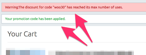
Something will always goes wrong. And when it does you want to catch the error and display it to the user with helpful tips on how to respond to it. This site decided to show two different status messages which have opposite meanings.
 Which one of these two messages is correct? The top one or the bottom one? If I had to guess I'd go with the bottom one because it comes last.
Clearly Describe the Problem
The second issue here is that they aren't describing the problem at all. The error message makes it sound like the coupon reached a maximum number of uses limit. The actual issue is that a coupon can only be used one per user and the system is freaking out because the user isn't logged in.
If you really do need someone to login then tell the user that in your error message.
Have Sensible Defaults
I sent out that coupon to my newsletter of 280 people. Of those 280 people 97 of them clicked the link in the email to buy a product. And of those people 18 emailed me that the coupon wasn't working. And that begs the question – how many people actually bought the product (by logging in first) and how many people didn't email me at all and just gave up?
What would happen if the software checked the email address instead of checking for a logged in user? That would still make sure the coupon can only be used once per person, you don't force someone to login, and there aren't any errors. It just works.
This is actually exactly what WooCommerce does and I didn't even know how important it was until I ran into this problem myself and saw that 20% of my users failed and had to email me for help. Don't make your users beg you for help. Make sure your software just works.